Askim Red Cross
Brochure redesign - Layout and Text Enhancement
Client project
Role: Designer & Copywriter
Contribution: Text, layout, and overall brochure design.
Client: Askim Red Cross

"We approached Malin with a request to help us create a new brochure to promote our activities. The result exceeded our expectations. The brochure clearly communicates everything we do in our humanitarian work.
The board is extremely satisfied with the outcome and grateful for her assistance.
Malin Forbord is highly recommended for projects of this nature!"
Terje Haga, Head of Askim Red Cross
Context
The Red Cross in Askim wanted to improve its volunteer recruitment brochure.
The existing design was difficult to edit and lacked space for new activities. They needed a solution that was visually appealing, easy to read, and highlighted the benefits of volunteering in a way that felt inviting and inspiring.
Design Challenge
How might we redesign the brochure so it is clear, flexible, and visually engaging, while effectively communicating the advantages of volunteering with the Red Cross and encouraging potential volunteers to take action?
Previous Design
-
Inconsistent text sizes, line spacing, font style, etc.
-
Text is pressed down at the bottom of the page.
-
The Back Page looks like it's shifted and ended up too far down.
-
Inconsistent alignment. Shifts between left-aligned and centered.
Back Page
Front Page

-
Poor visual hierarchy
-
Page 1 is very text-heavy and lacks clear separation between sections. No white space makes it overwhelming, hard to scan, and causes cognitive strain.
-
The red banner at the bottom (“Bli frivillig i Røde Kors!”) competes for attention but doesn’t guide the eye effectively.
-
Page 2 has better spacing, but still feels cluttered because of the multiple images squeezed together at the bottom.
-
A lot of visual elements compete for attention.
Page 1
Page 2

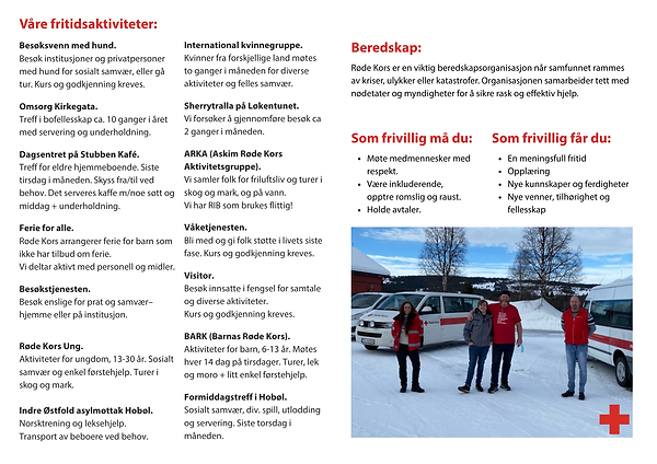
Solution
-
Improved Visual Hierarchy - making the content easier to scan.
-
Cleaner Layout - Better use of white space to reduce clutter.
-
Use of Images - One image instead of four makes the design calmer and easier on the eye.
-
Stronger Branding - The Red Cross logo is prominently displayed, making the organization and district office immediately recognizable.

-
Use of Images - Uses a single photo to complement the text without overwhelming it.
-
Less Visual Elements Competing for Attention - Removing the image strip/photo collage at the bottom of the page makes the design harmonious compared to the previous version.
-
Better Readability - Bullet points for activities are well-spaced and grouped logically. Font sizes and weights are consistent, making the brochure easy to read.